
Growthpad Consulting Group
Brand Identity Revamp
About Project
Growthpad Consulting, a rapidly expanding Pan-African firm, offers strategic communication, innovation, and digital media solutions. Formerly Growthpad Digital Consulting, the brand needed a bold new identity to reflect its broader scope and growing presence across the continent.
I led a full rebrand crafting a new logo, visual system, and design language that blends modern professionalism with African authenticity.
Challenges
This rebrand wasn’t just about a new look — it had to reflect Growthpad’s expanded service offering, communicate confidence and credibility, resonate across diverse African markets, remain modern and versatile across all platforms, and subtly nod to African heritage without relying on cliché or overused symbols.

Creative Direction
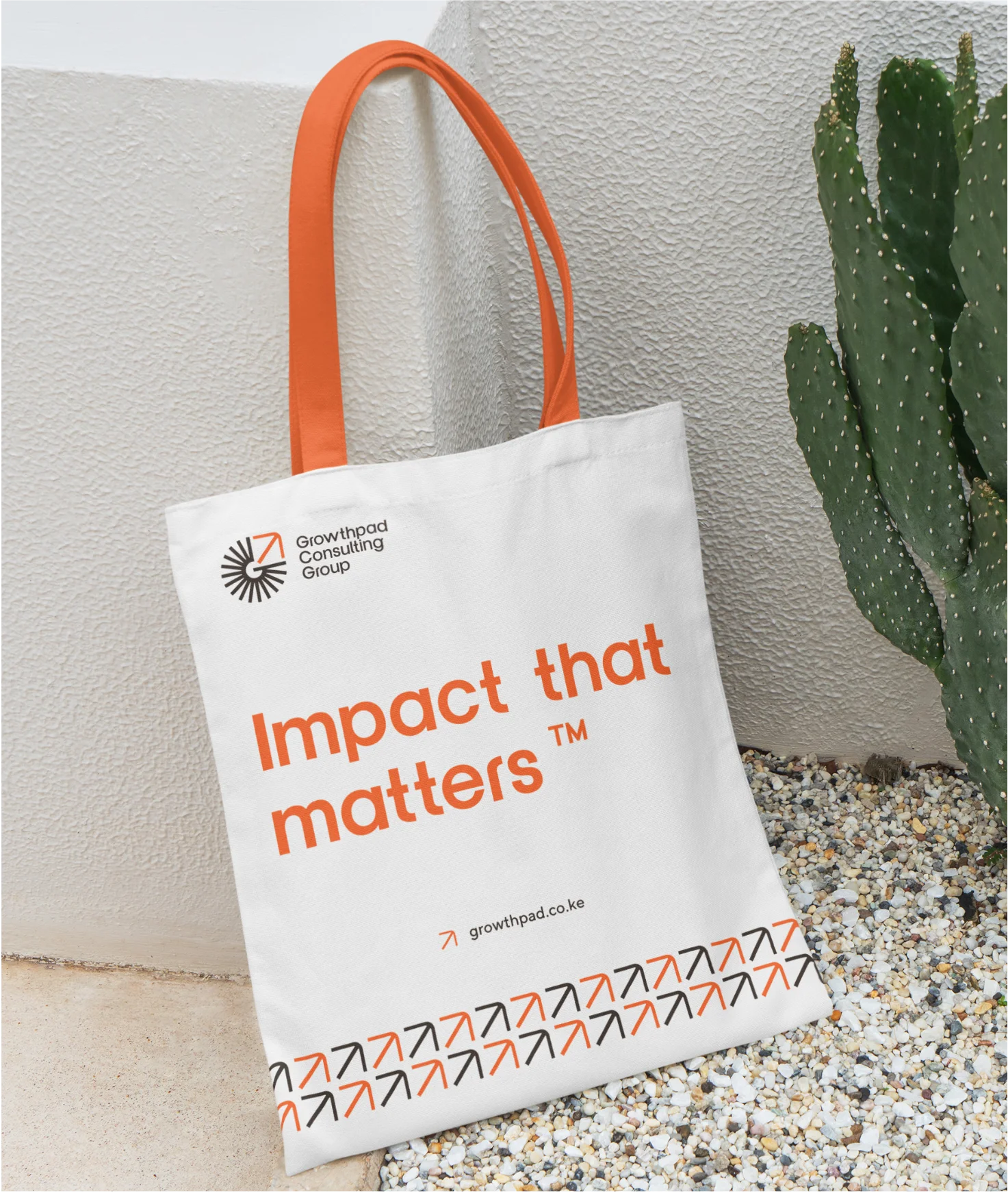
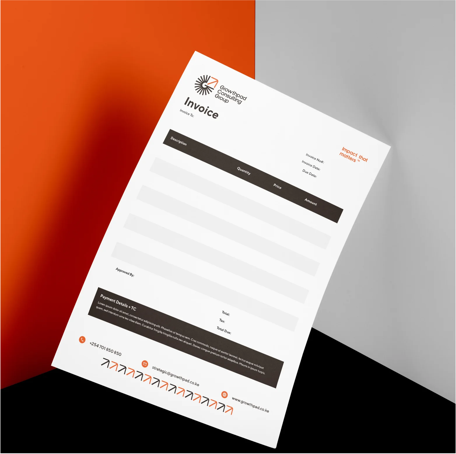
The final identity centers around a radial “G” motif — a symbol of dynamic reach, connection, and forward momentum. An upward-pointing arrow within the form signals growth, ambition, and elevation, tying directly to the brand name.
The logo is supported by a fresh, sophisticated color palette and a carefully selected font pairing:
- Clover Display adds elegance and distinction
- TT Norms ensures clarity and usability across platforms
The result is a visual identity system that’s clean, future-focused, and uniquely African at heart.


Outcome
The client approved the final logo and visual direction with enthusiasm. The new identity is now actively in use across Growthpad’s platforms — elevating their presence and positioning in a competitive Pan-African landscape.
Personal Reflection
This project was a chance to translate strategic ambition into visual clarity. It challenged me to find the balance between minimalism and meaning, and to create a brand system that respects cultural depth while pushing toward innovation.