
Culinu
Logo design
Services
- Brand Identity
- Visual Design
- UI/UX
About Project
Culinu is a German company helping people and restaurants make smarter, healthier food choices. They needed a logo that felt fresh, modern, and clear — something that could speak to everyday users while still looking professional for restaurant managers. The goal was simple: capture their commitment to conscious eating and smart kitchen management in one clean visual identity.
Challenges
The brand had to balance two worlds: health-focused users and busy restaurants. The identity needed to feel friendly but still structured, modern but not overly technical. And most importantly, the logo had to be completely custom-made to give Culinu a unique, ownable look.
Creative Direction
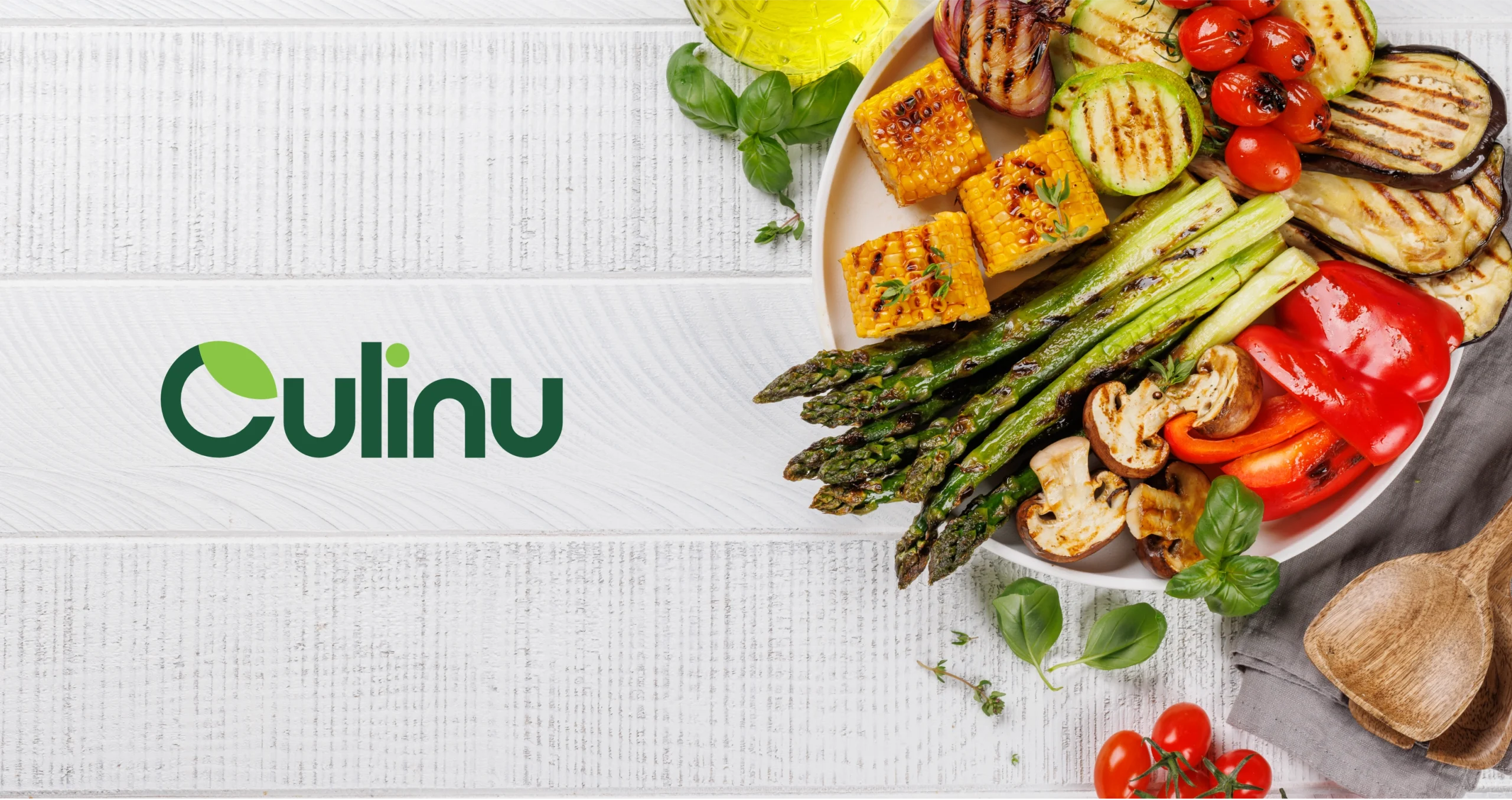
I started by designing the logo from scratch using geometric shapes — no fonts. The idea was to build a clean, balanced wordmark that feels fresh and calm.
The leaf inside the letter C became the heart of the identity. It represents natural ingredients, conscious choices, and a more mindful way of eating.
A green-led color palette reinforced this sense of health, clarity, and simplicity.
Outcome
The final identity is modern, minimal, and instantly recognizable. The custom logotype feels clean and confident, while the leaf symbol gives the brand a warm, natural touch. The system works seamlessly across the product, website, and marketing, giving Culinu a strong visual foundation as they grow.
Personal Reflection
Culinu pushed me to dive deeper into custom logo construction and shape-based design. Building every letter by hand helped create a mark that feels truly unique. It’s a project I’m proud of — simple, intentional, and crafted with care.